
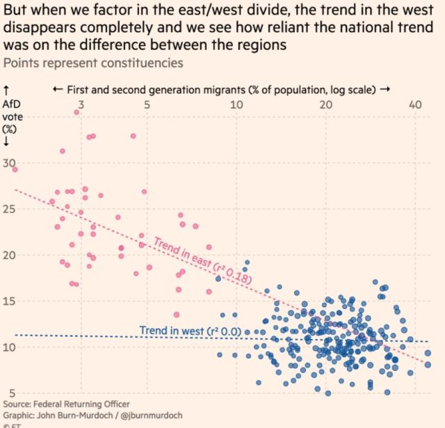
I object to usage of “trend” to indicate “relationship” (for me “trend” implies over time) but that is just a quibble. Perfect illustration of importance of visualizing data.
PS. Doug Campbell reminded me of importance of a title for the graph, and suggested “Relationship between support for the German AfD party and the % of 1st and 2nd generation migrants.”
